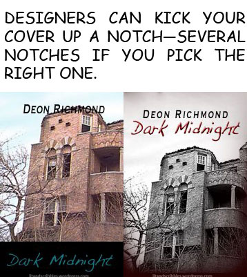
This is the 4th post in the How to Design a Book Cover series.
Now that you’ve learned about all that goes into designing a fabulous cover for your novel, hopefully you’ve also realized hiring a professional to do it for you is exactly what must be done.
First and foremost, don’t just hire any designer. When you’re looking for a designer, ask for samples of other work that they’ve done. If they’re a professional, they should have a portfolio of work to share with you. Be clear on the terms of how much it will cost you up front, including if they charge for any changes like typos or the wrong photo, etc. Some professionals will charge a flat fee, some will do it per hour. According to Scarlett Rugers, a book cover designer from Australia, if you want the kind of cover you see from the major publishing houses, you can expect to pay somewhere between $500 and $1200.
 Why is it so pricy? Often you’re getting unique materials, basically stuff you won’t see on other covers. They won’t be using templates, your cover will be completely unique. However, you can it done for a lot less, just remember the other adage: you get what you pay for.
If you are going to go the cheaper route, make sure you do ask for samples of previous work. It also never hurts to Google their name to see if they’re legit, or at least see that no negative hits show up in your browser. Get all the terms up front, and at the very least have them send you all this information including total cost in an email, then print it out for your records.
Having both worked with freelancers and worked freelance myself, I find it’s always a good idea in any sort of transaction. Often in the graphic design world, this is called having them send you over their bid—although that’s usually with business professionals vs. freelancers. But the point being, get it in writing before you surrender any of your $$$.
We’ve already discussed a few things you can do to help your designer help you, but let’s pull it altogether in one spot. Your designer likely doesn’t have time and unless they’re a really good friend probably won’t read your entire book before designing your cover for you. But they don’t necessarily have to. This is where your own preparation will come in handy in getting you the cover you want.

Bright colors, swirling magical sky, lightning, and a bus. Appeals to the right age group while incorporating elements from the actual story.
One of the things you should have ready right away for your designer is the book blurb they’ll put on the back or that you’ll use to describe your book for the e-reading audience. In addition to a book blurb, prepare a one-page summary that gives them an idea of what kind of story it is—not necessarily a synopsis, but something that helps them know what the book is about. Imagine you’re telling them about one of your favorite books or movies they’ve never seen. What kinds of things would you point out to them if they were designing a cover for that? What kinds of things would you point out for them to design your cover with?
Bring your list of adjectives and any other descriptive words to give them an idea of the kind of mood you want to convey on the cover. You’re a writer, so descriptions should be old hat for you. 😉
You might also consider finding covers you like or even art or advertisements and bring them as samples of what you’re hoping for.

If your book is a western, a picture like this could be great inspiration for cover design. They might use that leather look as a book border or to stylize the font, etc.
At the same time, don’t be afraid to ask them to contribute. I worked with a videographer where I told him what we definitely needed for footage, but told him more of the kind of mood we were trying to convey and expressed I was totally open to him bringing his own artistry and creativity to the table. He came up with shots that I wasn’t sure about at first, but looking at the footage later I realized were fantastic.
Graphic designers are creative people too with their own fabulous ideas. Do your best to strike a balance between the two of you. You don’t want to end up with a cover you don’t like because you didn’t say anything, but that can also happen because you were too controlling. Again, it’s all about balance.
Remember that cheap and fast usually never equal great. So if you must go the cheap route, expect that it could take a little longer than you’d like.
SUMMING UP
Do some preparation work so that you can clearly tell your designer what your story is about and the mood you want to convey. Bring the following to your designer:
- Book Blurb
- One-Page Book Summary
- List of Adjectives and Other Helpful Words
- Samples of the Look You Want
The difference in using a professional can be massive. You’ve already seen what even the slightest bit of thought can do to improve a book cover in my previous post. Remember Dark Midnight?

But do self-published authors really put that much effort into their covers? Do they really go out and find a good designer? Many I could find on the Twitterverse hadn’t and I was feeling a little discouraged for the self-publishing industry. That was until I came across a book called Sempre by J.M. Darhower.
 Ms. Darhower was kind enough to let me feature her cover here as what I think we can all call a success when it comes to book cover design. Not only is it very appealing, but it tells us a lot about her story before we even read the book blurb. The cover is white, probably to portray innocence. Yet there’s a gun and a bloodied rose. So we know there will be some kind of danger involved, likely life-threatening. Then the bloodied rose… Since roses tend to symbolize romance, we infer there’s probably some kind of threatened or fading romance along with the loss of innocence.
I read her GoodReads book summary, and yep, pretty much her cover is spot on at giving us a sense of the story. (And both the summary and the cover make it so tantalizing, don’t you think? Grab it on Amazon here.)
She did it right. So should you.
Tomorrow we finish up the series with the Bottom Line. See you then!


 Ms. Darhower was kind enough to let me feature her cover here as what I think we can all call a success when it comes to book cover design. Not only is it very appealing, but it tells us a lot about her story before we even read the book blurb. The cover is white, probably to portray innocence. Yet there’s a gun and a bloodied rose. So we know there will be some kind of danger involved, likely life-threatening. Then the bloodied rose… Since roses tend to symbolize romance, we infer there’s probably some kind of threatened or fading romance along with the loss of innocence.